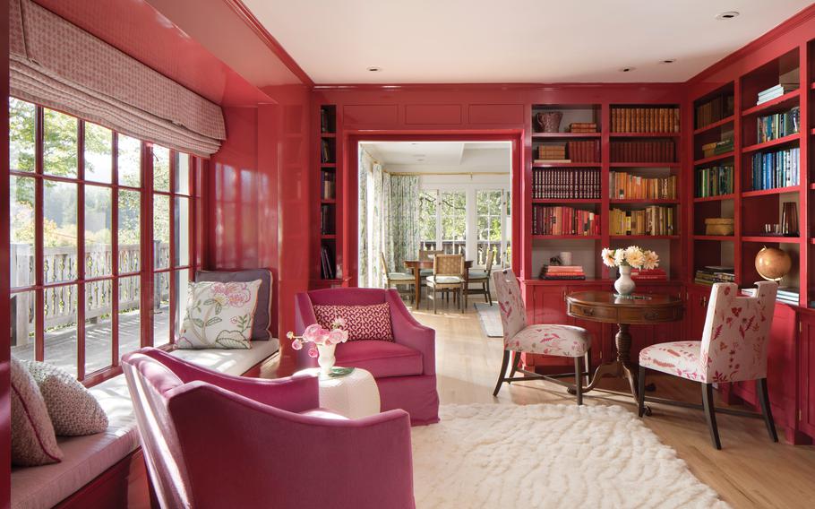
Designer Ann Lowengart created this pink library for a client who loves to wear the color. To use your wardrobe to guide your decor, Lowengart advises thinking beyond the colors you wear most often, since, for many people, those may be black and neutrals. Instead, consider which pieces “light you up,” she says. (Ann Lowengart)
Chanel Boeve-Roth was browsing an estate sale near her home in North Bend, Wash., when she spotted some emerald, hanging lights and a celery-hued chair in the shape of a hand. The combination sparked the entire vision for her front room.
"I just knew, after seeing them, that I wanted that whole space to be cohesive and green," she says. The result "is a place where I'll make a cocktail, sit down and just relax after work."
Color trends come and go. Each year, Pantone releases its color of the year (2023's is magenta), and design experts hail one shade or another as "the new neutral." But going all in on a monochrome palette, for no reason other than you love it, can simplify the design process while creating drama and a specific mood.
In a world of all-white kitchens and endless shades of gray, here's how to embrace your favorite color with abandon:
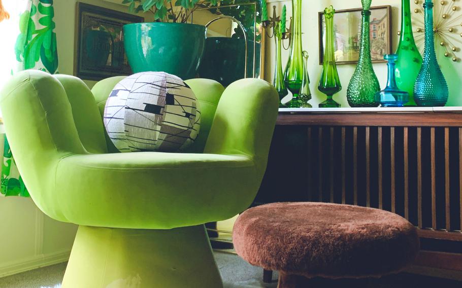
This funky, hand-shaped chair was one of the first pieces that Chanel Boeve-Roth picked up for her green sitting room. The combination of the chair and some emerald hanging lights sparked the vision for the entire room. (Chanel Boeve-Roth)
Let statement pieces lead the way
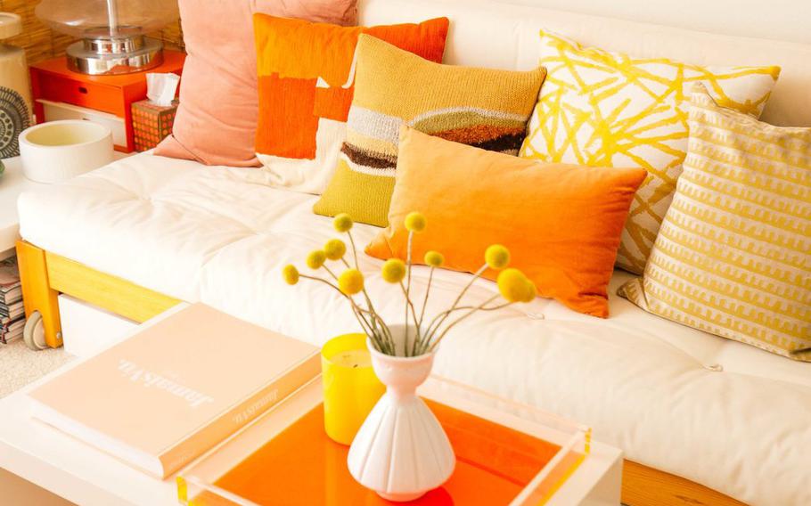
Boeve-Roth, a self-proclaimed "maximalist" who often shares photos of her home on Instagram, loves decorating rooms in only one color. Her living room features an orange couch and retro orange decor, and she's in the process of redoing her bedroom in all red. In each case, the color scheme was determined somewhat by happenstance: After finding a vintage statement piece that caught her eye, she decided to let it dictate the rest of the room.
The same estate sale with the green treasures yielded the orange lamp that served as the starting point for Boeve-Roth's living room. It's a nostalgic color for her, reminding her of her grandparent's home. "I love collecting things and the idea of filling a space with things that make you happy," she says.
She took her time hunting for other thrifted items to fill out each room, often for bargain prices. A painting of a field in her front room was a $10 score at Goodwill.
Consider the colors you like to wear
Annie Lowengart, an interior designer and founder of the firm Ann Lowengart Interiors in Marin County, Calif., begins her projects by giving clients detailed questionnaires to learn about their preferences, including clothing styles. Often, the results steer them toward a color that she digs into for a particular room.
For one client, Lowengart did an all-pink library. They came to the idea after discussing the client's fashion choices.
"She has a beautiful wardrobe," Lowengart says. "I've seen her in a lot of formal events. She's worn Carolina Herrera and Oscar de la Renta, and she really loves pink."
To use your wardrobe to guide your decor, Lowengart advises thinking beyond the colors you wear most often, since, for many people, those may be black and neutrals. Instead, consider which pieces "light you up," she says. Maybe you gravitate toward turquoise accessories, or a purple scarf. Then consider that color in the context of the room. If a bright purple living room seems too loud, perhaps a more muted version — such as lavender or mauve — could work instead.
Varying textures and tones of the same color helps break up a monochrome aesthetic, designer Jonathan Lo says. (Jonathan Lo)
Vary textures and tones
Varying textures and different tones of the same color helps break up a monochrome aesthetic, says Jonathan Lo, a designer and editor in chief of the design blog the Octopian. "Otherwise, you run the risk of it becoming super matchy-matchy."
A good approach, he says, is to start with a neutral base and slowly add in color.
"I started with a blank slate of warm white walls, then added the big furniture pieces, keeping them in wood tones and upholstery in whites and creams," he says, describing what eventually turned into an orange guest room in his Irvine, Calif., home. "Finally, I added the color as accents." He also mixed in analogous colors (those that are next to each other on the color wheel), which, in the case of orange, meant reds and yellows.
Layering textures keeps your eye moving in the space and adds depth to a room, he says. "Different surfaces reflect light differently, so having both matte and glossy textures will help prevent the room from feeling flat."
Lowengart says that with monochromatic rooms, she adapts the principles of classic color theory.
"Sixty percent of a given room will be one color, 30% is a secondary color and that last 10% is a third color," she says. "We could use very different colors in that mix, but we also could use different shades of the same color. That's a great way to balance the space because it feels grounded in something."
Maria Killam, founder of the Killam Colour System, says a monochromatic room is easier to pull off with blues and greens, possibly because they both appear so often in nature. With other colors — say, purple — she says it's more important to choose shades with the same undertone.
Another consideration: Ensuring that "clean" colors (which Killam defines as "bright and fresh"), aren't clashing with "dirty" colors (which, despite the negative-sounding connotation, is just how she describes colors that are "muted and earthy"). In a monochromatic red room, for instance, candy apple red (a clean color), would not look great with burgundy (a dirty one), she says.
When painting a room a dark shade, designer Ann Lowengart recommends using a high-gloss finish. (Ann Lowengart)
Go glossy with dark paint
The key to coating a room in a bold color, Lowengart says, is to use a high-gloss enamel paint, such as Hollandlac Brilliant 98.
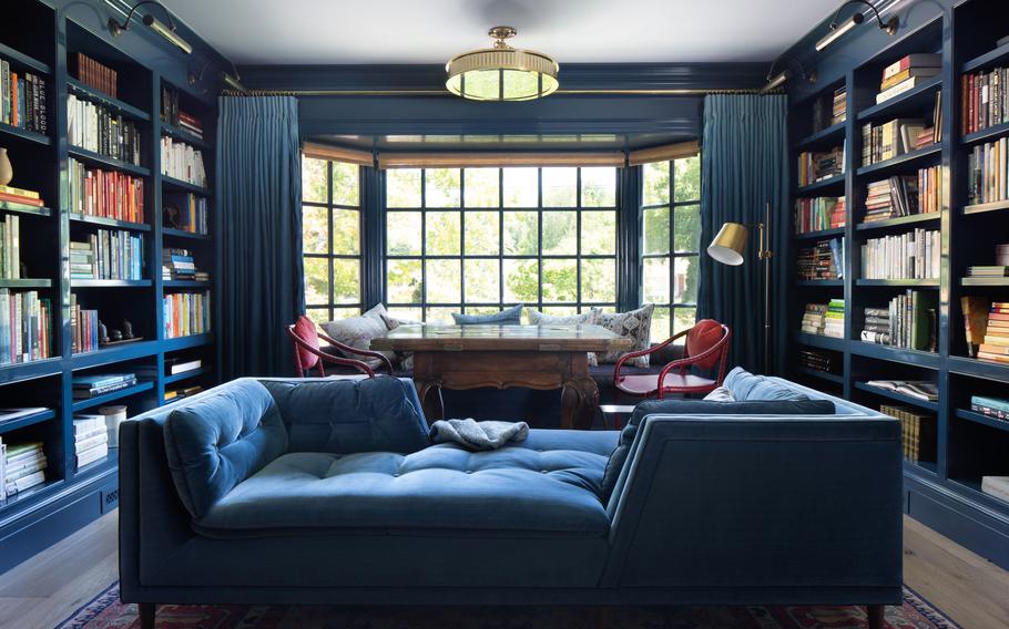
She bedecked a library in Los Altos, Calif., in rich blues, which appear in the paint color, the ZAK+FOX drapery and the sofas by Jonathan Adler that she had reupholstered in an indigo fabric from Cowtan & Tout. Against the monochrome palette, dozens of books, organized by color, stand out.
For the library's walls, the painter on the project mixed a small amount of the Hollandlac Brilliant with Gentleman's Gray by Benjamin Moore (a bit of a misnomer, as the hue is described as a "blackened teal blue").
"With saturated colors, what I've found over and over again is that you can go as dark and intense as you like if you add high gloss," Lowengart says. "It gives it a vibrancy, so it feels very upbeat, even if it's a really dark color."
Let the color palette evolve
Sometimes, a more focused palette emerges over time. When Lo began decorating his guest room, he felt inspired by Hawaii, where he often visits.
"The original idea was to create a sort of retreat vibe, and bring a bit of that tropical flair to lovely, suburban Irvine," he says.
One of the first pieces he bought for the room was a white couch.
"I had a hard time finding a color palette in the beginning," he says. He'd seen an image of a mid-century space filled with pillows of all colors and wanted to emulate the look. "I thought, if I kept the couch neutral, I could get away with using all the colors that I wanted. But then over the years, I started swapping stuff, and it started to take on more orange, warm tones."
He painted an accent wall bright orange, then later toned it down to a softer coral. Above the couch, he added a woven vintage art piece from an antique store in Palm Springs, Calif. The many throw pillows were picked up one-by-one from different sources, including Target, West Elm, H&M and Jonathan Adler.